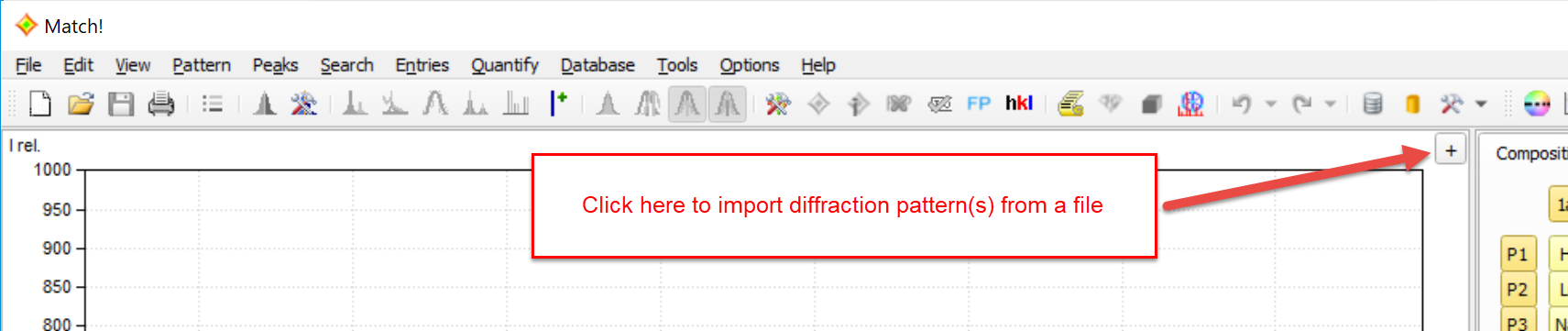
The diffraction pattern provides a graphical view of the powder diffraction data of the unknown sample (by default in blue color). You can click on the small '+' button in the top-right corner to import diffraction data from one (or more) file(s):
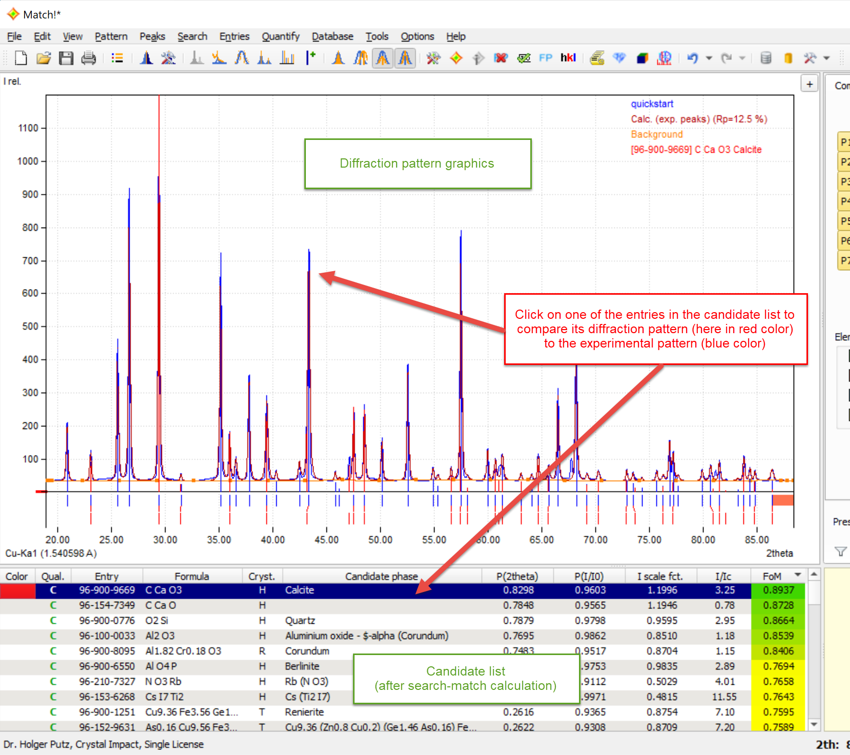
Once a search-match calculation has been run, the pattern graphics also displays the patterns of all entries that are marked in the candidate list or selected in the match list. Hence, if you would like to visually compare a reference database pattern to the one of the unknown sample, simply mark the corresponding line in the candidate list:
You can import more than one diffraction pattern (multiple patterns option). In order to do so, simply press the "+"-button in the top right corner again, or use the "Pattern / Insert/overlay..." menu command or the <Ctrl+I> keyboard shortcut.
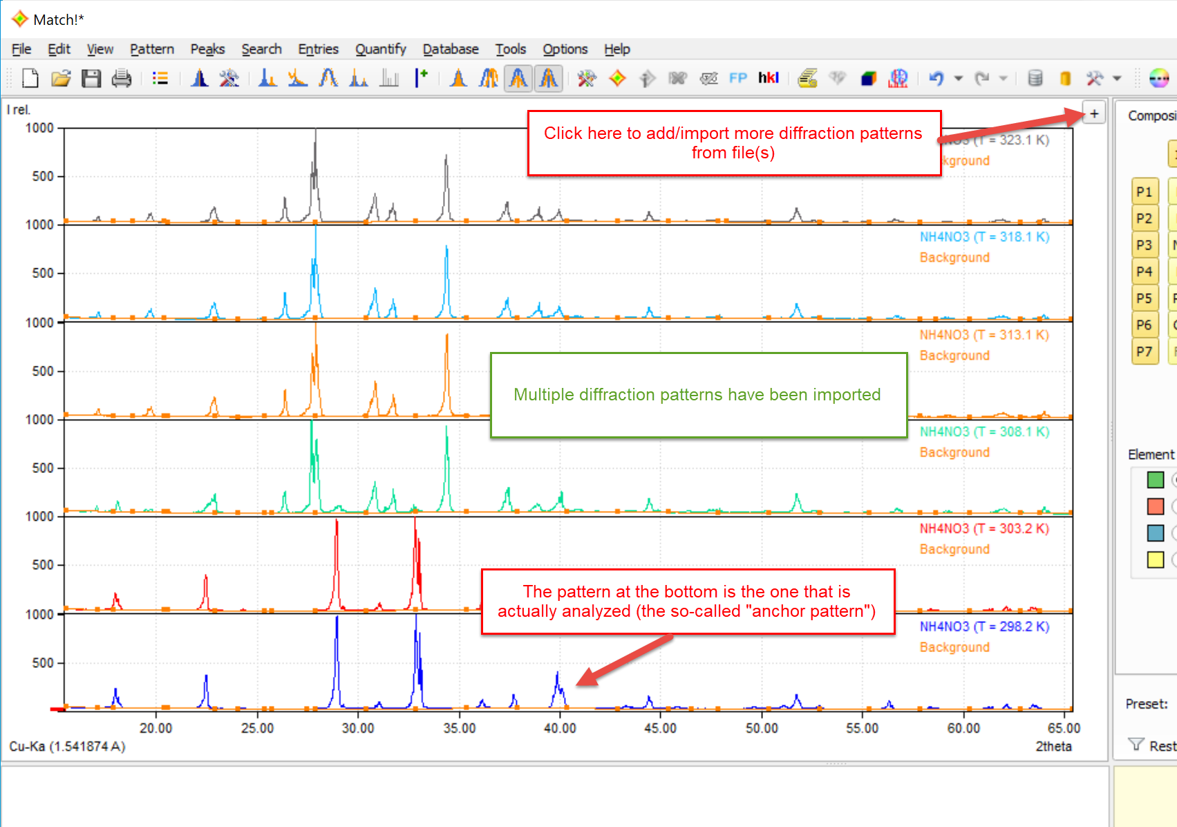
Once two or more diffraction patterns are present, they are by default displayed on top of each other in the pattern graphics area. The bottom-most pattern (the so-called "anchor pattern") is the one that is actually analyzed, i.e. the one to which the contents of the candidate and especially the match list at the bottom refer to.
If you swap patterns (see below), the candidate list will be updated if you swap the bottom most pattern and the one above. On the contrary, the match list is not affected by this. The background is that the multiple patterns option is not intended to have multiple phase analyses in one session. The swapping shall only support the decisions on the presence of critical phases.
Using the menu command "Pattern / Experimental patterns..." (or by pressing the corresponding button
 in the main toolbar at the top)
you can display a table of all currently loaded experimental diffraction patterns, along with
options to display / edit their sample ID, date/time, temperature, color, line style etc..
in the main toolbar at the top)
you can display a table of all currently loaded experimental diffraction patterns, along with
options to display / edit their sample ID, date/time, temperature, color, line style etc..
If multiple diffraction patterns are displayed, they are displayed with maximum vertical and minimum horizontal distance by default, or, in other words, they are stacked on top of each other. You can adjust the horizontal and vertical distance between them as follows:
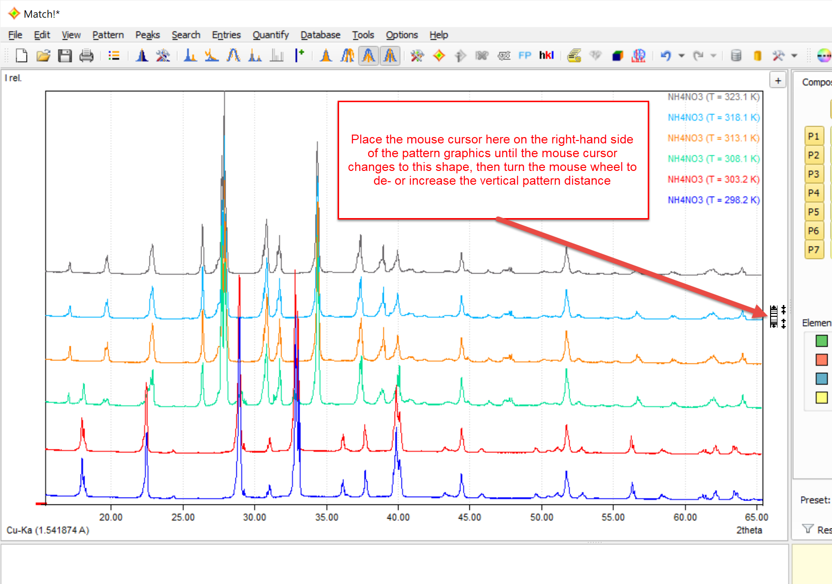
In order to decrease the vertical distance between multiple experimental patterns in the graphics, place the mouse cursor to the right of the diffraction pattern until the mouse cursor changes to  , then turn the mouse wheel up or down in order to decrease or increase the vertical distance between the experimental diffraction patterns. As an alternative, you can increase or decrease the pattern distance using the <Ctrl+'+'> or <Ctrl+'-'> keyboard shortcuts.
You can also toggle between full and zero pattern distance by pressing the mouse wheel (center button) if this cursor is displayed.
If the vertical distance between multiple experimental diffraction patterns is at maximum or minimum value, the corresponding y-axis scale(s) are displayed on the left-hand side. However, if the pattern distance is somewhere between these two extrema, the y-axis scale is hidden.
In order to get a "3D-like" representation of multiple diffraction patterns, you can also increase the horizontal distance between the patterns. The option to increase the horizontal distance is only available if the vertical distance has already been reduced (see last paragraph). Increasing the horizontal distance will lead to a "3D-like" view of the different experimental diffraction patterns.
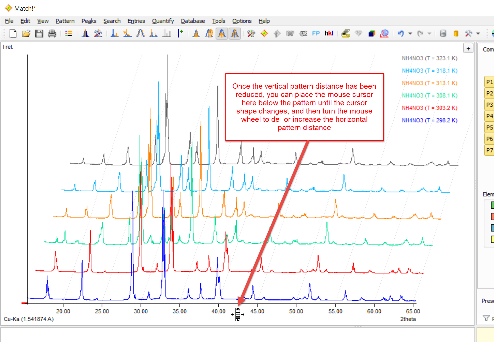
In order to increase the horizontal distance between multiple experimental patterns in the graphics, place the mouse cursor in the space below the diffraction pattern until the mouse cursor changes to ![]() , then turn the mouse wheel up or down in order to decrease or increase the vertical distance between the experimental diffraction patterns. As an alternative, you can increase or decrease the pattern distance using the <Ctrl+'+'> or <Ctrl+'-'> shortkeys.
, then turn the mouse wheel up or down in order to decrease or increase the vertical distance between the experimental diffraction patterns. As an alternative, you can increase or decrease the pattern distance using the <Ctrl+'+'> or <Ctrl+'-'> shortkeys.
Like with the vertical distance, you can toggle between full and zero pattern distance by pressing the mouse wheel (center button) if this cursor is displayed.
You can compare peak positions in multiple diffraction patterns more easily by activating the option to display a vertical line at the cursor position, e.g. by pressing the keyboard shortcut <Ctrl+X> (see Graphics options).
If the horizontal pattern distance is increased ("3D-like" view) when this option is active, a so-called "string of pearls" is displayed at the mouse cursor position. This means that colored circles are displayed at the corresponding intensity value at the cursor position for each individual pattern:
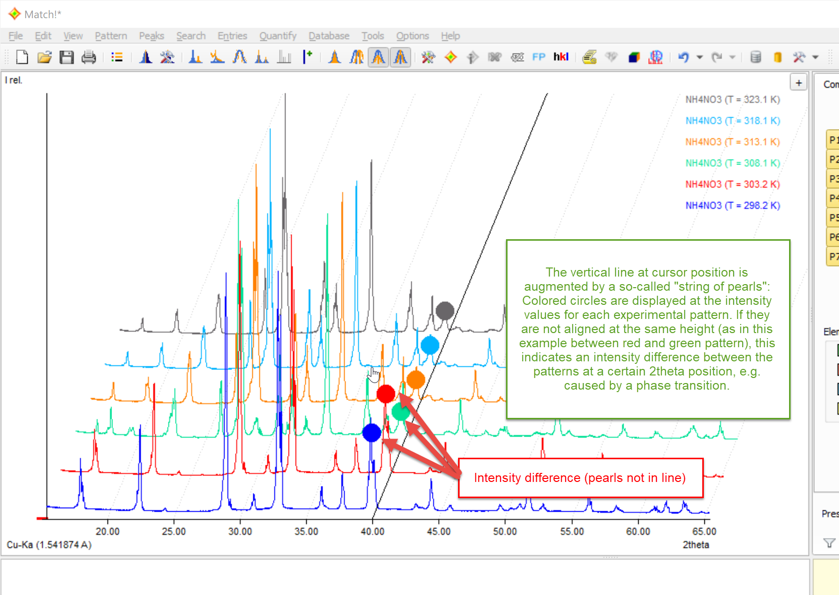
When moving the mouse cursor to the left or right, you can now determine intensity differences between the individual experimental patterns more easily. This can be helpful e.g. to detect phase transitions etc.
Note: The mouse cursor is always located in the "xy-plane", i.e. the drawing plane of the anchor pattern at the bottom!
If you mark an experimental pattern in the graphics (e.g. by clicking on the profile curve or legend entry), it is displayed in bold, and the so-called pattern menu button  becomes available in the upper-right corner (instead of the normal '+' button for importing diffraction data).
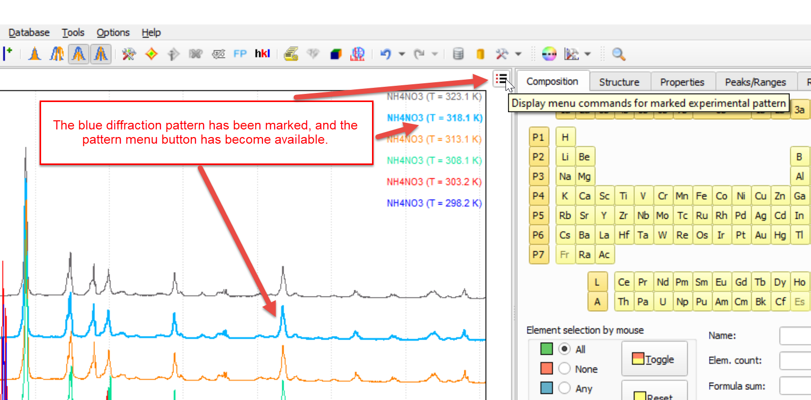
Once you press it, the pattern menu for the marked experimental pattern is displayed:
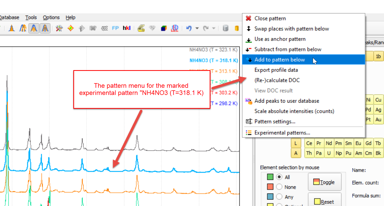
In the pattern menu, the most-common commands for experimental patterns are available. You can e.g. exchange (swap) patterns, close (remove) an additional pattern, (re-)calculate the degree of crystallinity (DoC), change the Pattern settings (e.g. color, sample ID etc.), and finally also open the Experimental patterns-dialog that provides access to all experimental patterns that are currently loaded.
You can do quite a lot of work directly in the pattern graphics by using your mouse, namely
The sample IDs, entry numbers and names of the patterns displayed in the pattern graphics are given in the legend in the top right corner of the pattern. The legend display can be configured as described here.
If the profile calculated from the peak data is displayed and raw (experimental) profile data are present, the corresponding Rp-factor is given in the legend as well.
If the peak data of a match list entry result from a pattern decomposition calculation, this is indicated by a "[PD]" in the legend of the pattern graphics.
The radiation and its wavelength are displayed in the corner on the lower left-hand side. They can be changed e.g. by clicking on this label.
The diffraction pattern graphics can be configured individually by the user as described here.